On Saturday I drove to Lowell to photograph. It’s about 25 minutes east of Grand Rapids. I was surprised to find the streets crowded with parked cars and the area around the Lowell Showboat filled with people. It was a Lowell Pride festival, with familiar rainbow colors and flags everywhere and a drag show going on while I there.
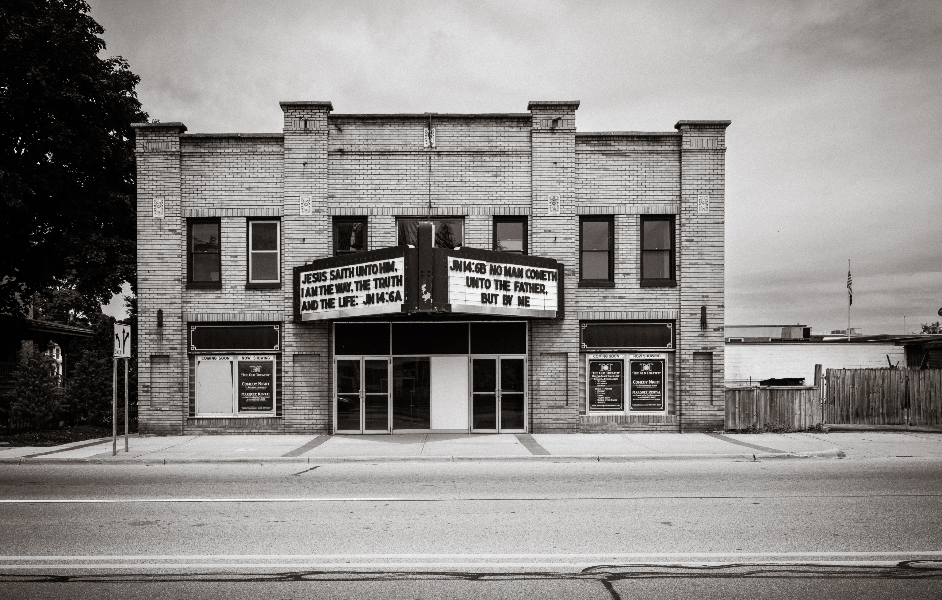
There was some controversy early in the week. The marquee on the “Old Theatre” is rented out for $50 a day. A church has it rented this month and had put up a quotation from Proverbs 11 about pride leading to shame. By the time I got there, it was a less controversial quotation from the gospels.
I did not spend much time wandering around the crowded festival, partly because I was there for the small town architecture, partly because I am still a bit nervous in crowds, even outside, when I don’t have a mask. But the pride symbols on many of the businesses added to color already there in the classic architecture.
As usual, my color and tone palette has been shaped by a mix of looks that I associate with Polaroids from the 1970s and 1920s-era postcards.
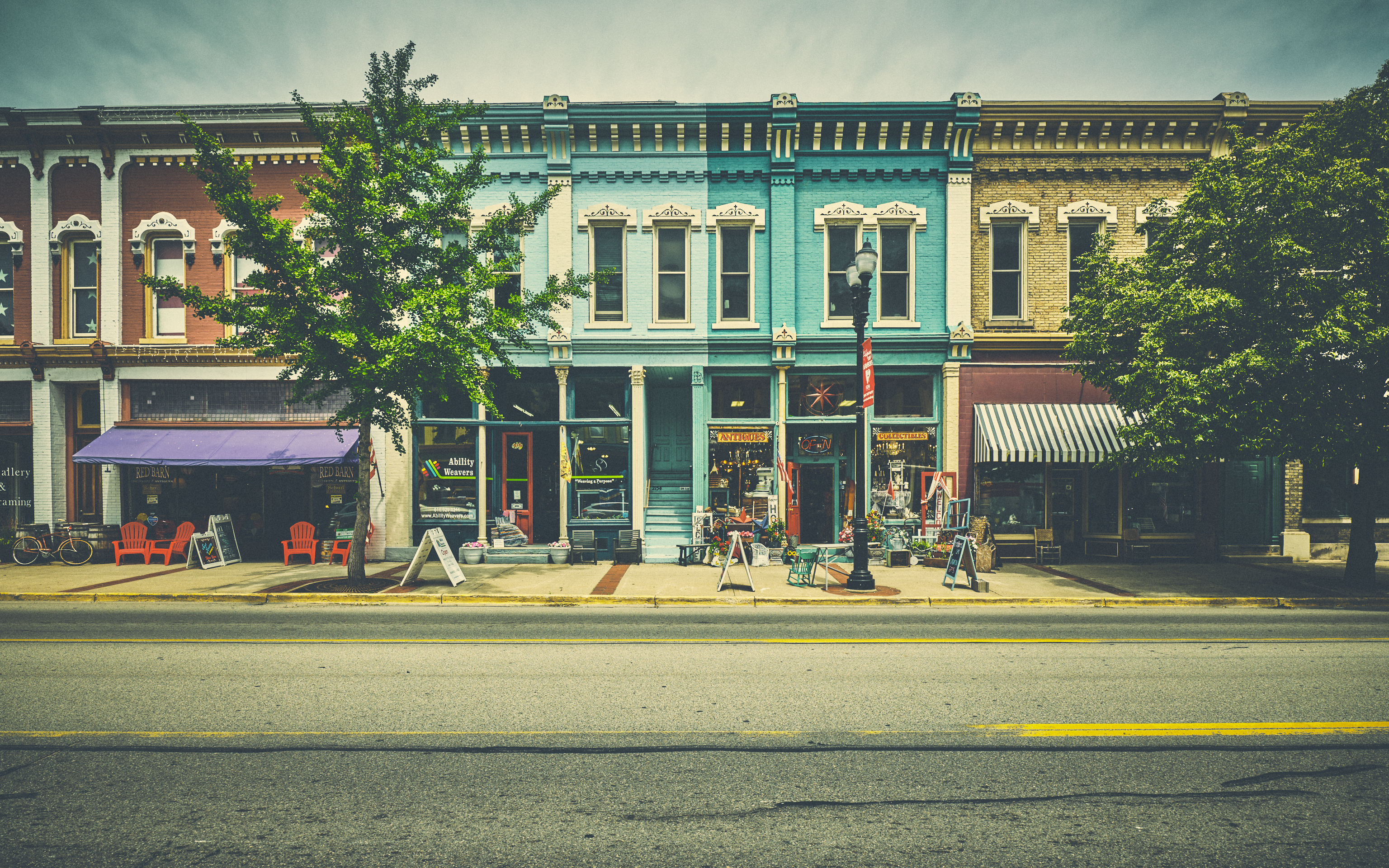
My favorite image is this one, I think, simply for the colors, particularly the shades of blue in the center. I was curious why the (presumably two) owners went went different shades. It’s a little odd and jarring. It looks like there had once been one unit, with a stairway to the second floor in the center, but the now separate units are now owned by different owners. I wonder if they squabble over other matters than paint colors.
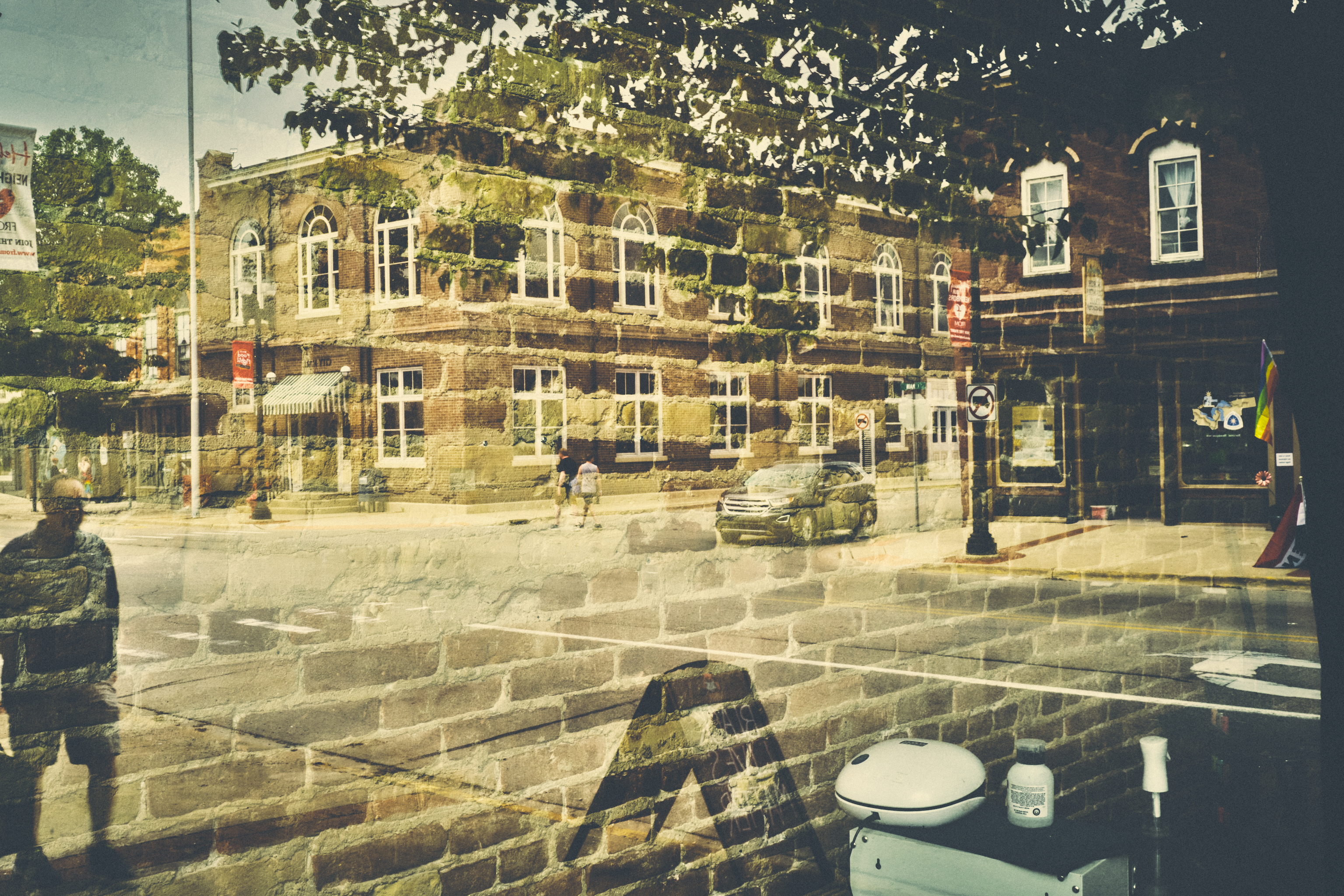
The mirror image in a storefront window provides nice texture, with the bricks inside the store overlapping with the stone in the building across the street. The pedestrians, car, and equipment in the store (at the bottom) provide some stability in an image that has some visual chaos.
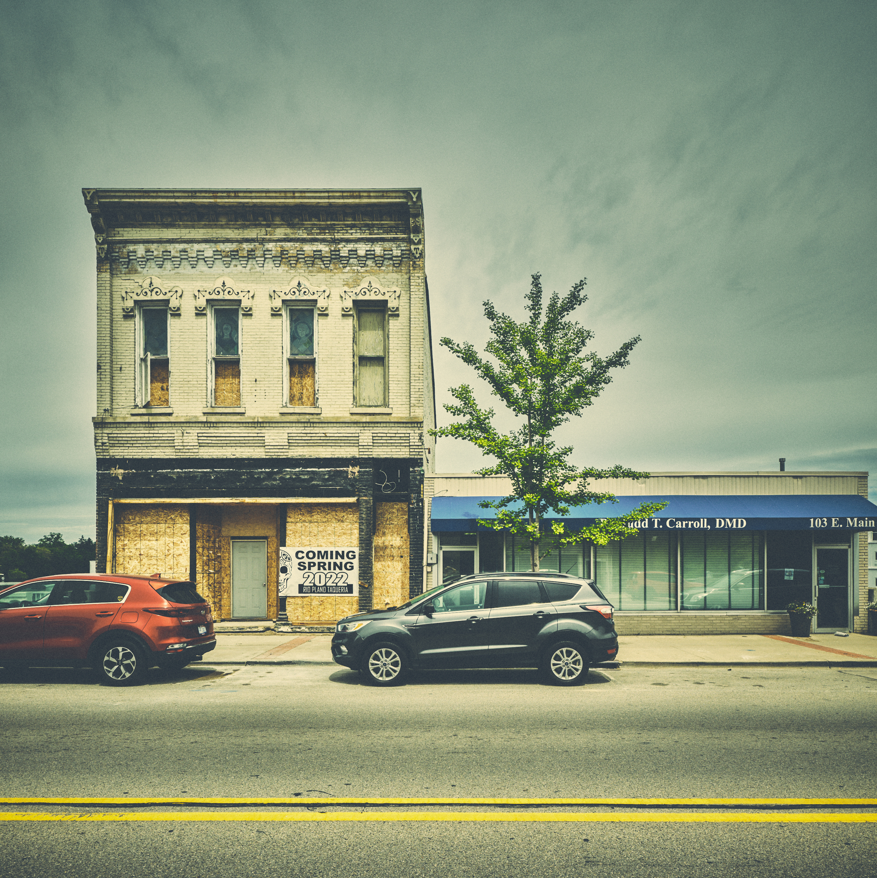
This old beauty–also the cover image of the blog post–also drew my attention. It’s being renovated and will open as a restaurant (apparently later than the sign suggests). Click on the image for a larger version and check out what look like stained-glass windows on the second floor. The perfectly respectable business on the left seems sad by comparison. No faded beauty or promise restoration of it, just function.
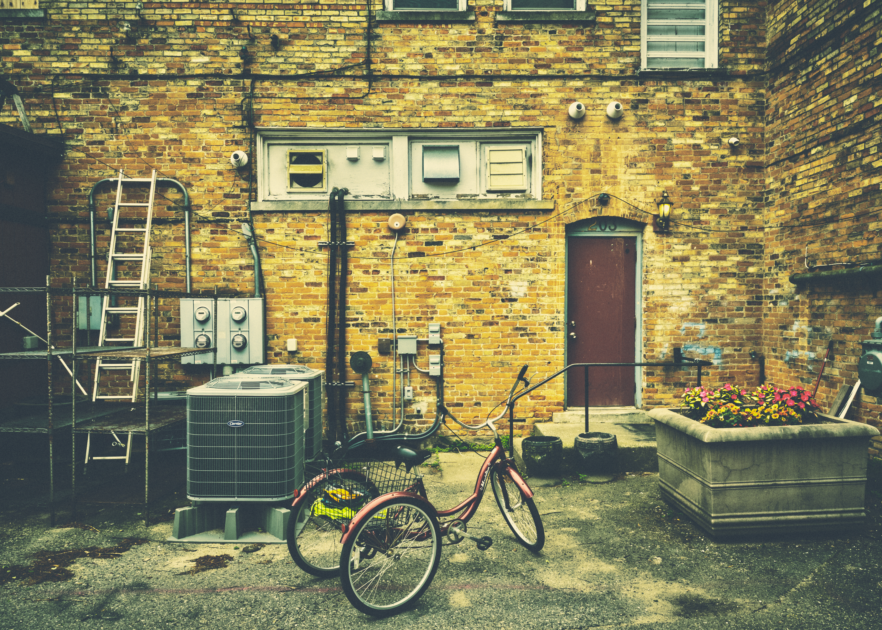
Finally, it’s not just the front of buildings, but the back, where alleys and parking can be fond, that are interesting, as this image shows. The tricycle first made me stop and look; the other elements made a nice tableau.
It has been a while since I’ve photographed landscapes. The colors in Michigan small towns seem so much more interesting than the relentless green of summer and gray of late fall and winter.
I’m now thinking about ways to circle back to the towns I’ve done over the past year and photograph them again, with a variation on last year’s project, whether something other than business districts or from a different view. Perhaps time to get my drone out again.
