One of the things that I associate with the 1970s is Polaroid cameras. I remember both the peel-off film and the later prints that you didn’t have to peel apart. It was fun to watch the image slowly emerge on the print.
A photographer whose work I like, Patrick La Roque, recently developed some Polaroid-inspired presets for Capture One (a competitor of Photoshop). So this weekend, I went to the village of Ada, east of Grand Rapids, to shoot some images that might go well with the Polaroid-style presets.
The presets are just a starting point. They can look quite different depending on whether you decrease or increase exposure or adjust the color. I some cases I stuck close to the preset as is; in others I adjusted more.
Here’s a few in black & white. I like the compressed tones and soft look. As the photographer who made the presets says, the point of these images is not technical perfection but the feel of the images. I used a wide angles for some of these (18mm full-frame equivalent) and generally stuck to at relatively wide lens lengths for the rest.

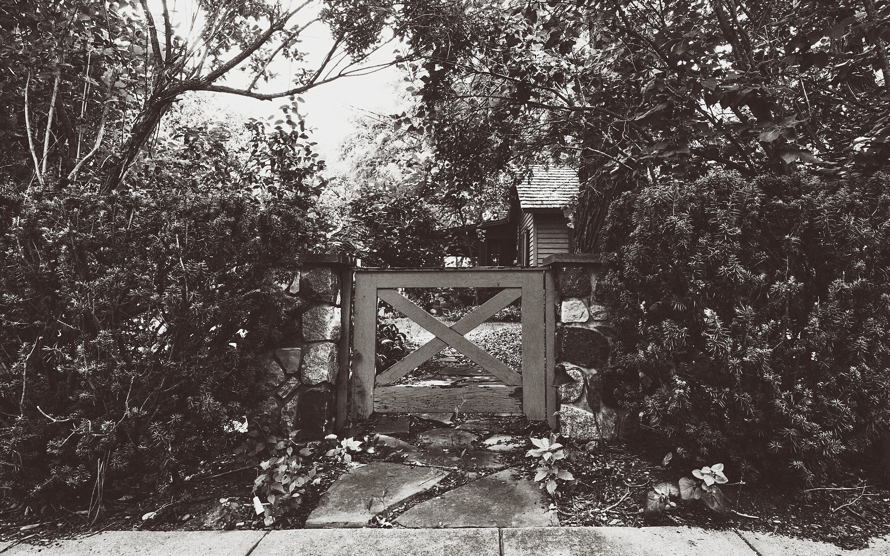
The next is a good example of the black & wide Polaroid look I remember. The shadows at the top leave no visible detail–a faux pas from a technical point of view. The look is soft, which makes the image easy to look at. I like using “clarity” and “structure” to sharpen images, but doing that can make images feeling jangly and stressful–sort of like too much treble in music.
This image and the two above have a lazy summer day vibe for me, reminding me of playing with a Polaroid or cheap 110 Instamatic film camera when I was a kid on a family vacation. A bit bored, at times, perhaps, but enjoying having nothing to do, the camera providing a bit of entertainment (even if just annoying my sisters or cousins with it).

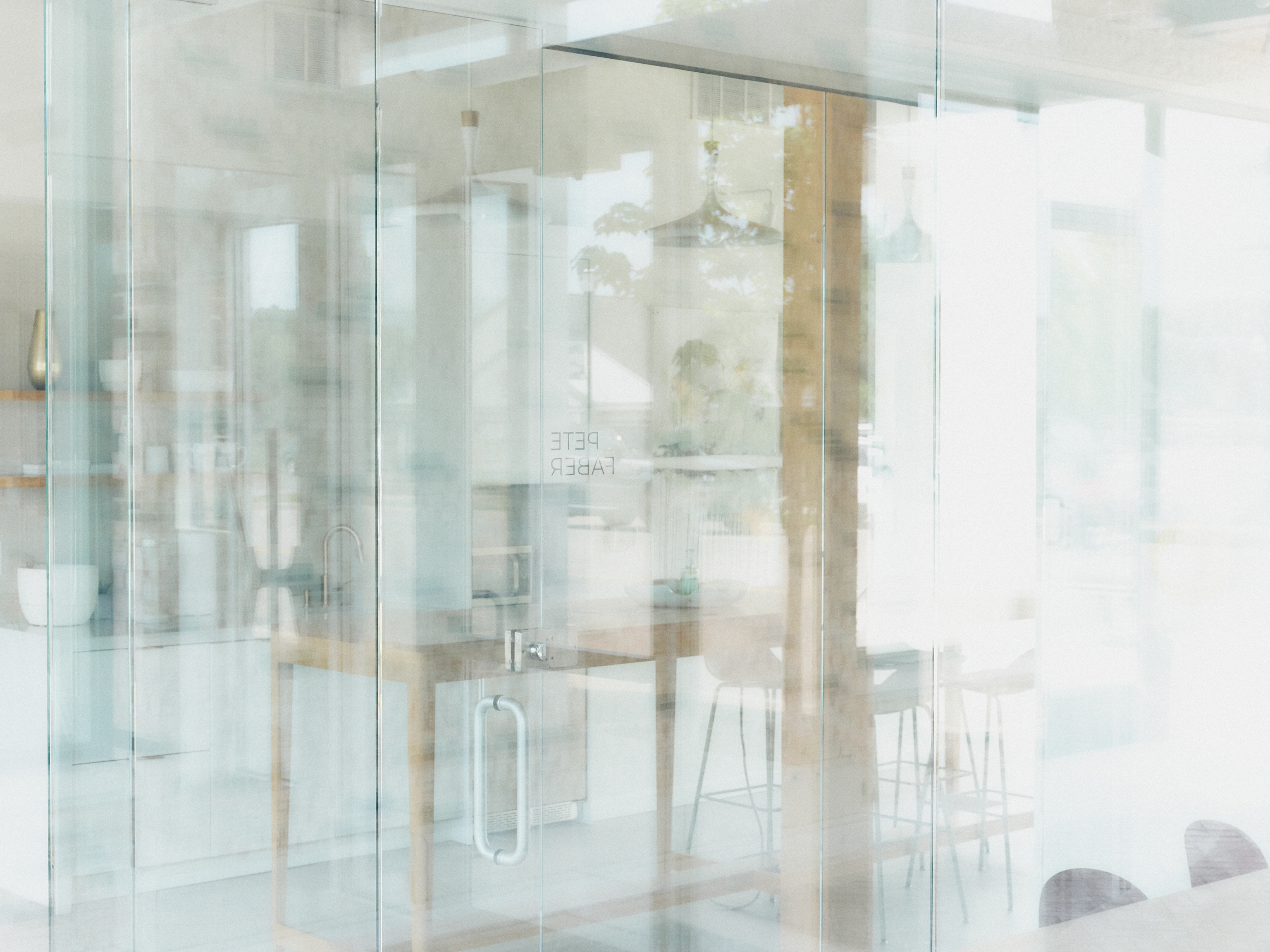
One of the fun things about Polaroid color film was the odd hues, along with the same compressed tones as the black & white film. I photographed some shops in Ada to play with some of the color looks in La Roque’s presets.
I think this image is my favorite from the day, though I liked the next two as well. I reduced the color saturation a bit, but not much, and upped the exposure. The glass, furniture, and décor suited the soft look and color of this preset. I ended up with less a Polaroid look, perhaps, and more a pastel watercolor feel. But I like it. And if this is one thing these presets can do, that’s great.
The colors are stronger in the the next two, even though in both cases I reduced saturation a bit. The first of the two is a better image, I think: the entrance to a hardware store. There is a lot of detail to enjoy. But the other holds my attention–the mannequins are a bit eerie in their facelessness. The strong yellow in both images is partly the preset, but also the paint on the hardware store siding and one of the walls in the clothing shop. Instead of “fixing” it, I left it pretty much as is.


Finally, one last shot. I was just playing with the wide angle lens. I thought it be fun to make the fence look much longer than it really is. The kind of thing I might have done as a kid. Just play with the camera. And I wanted to see what a preset that went well with the red-orange in the image would do.

If you can, enjoy the summer. The heat out West is terrifying this weekend, much like a week ago. And COVID is roaring back on parts of the Plains, Midwest, and South, especially where the “Delta” variant is finding lots of unvaccinated people. So be smart, be safe, for your own sake and your neighbors.

Excellent compositions. Beautiful atmosphere.
Thanks. Glad you liked them.