I’ve been doing a fair bit of telephoto images lately, not so much to get “close up” (my feet can do that) but to “compress” the details in the image. The magic of telephoto lenses is not getting you close up, but reducing context, isolating the subject, and reducing distance and space. Stuff looks close together. The magic of wide-angle lenses, similarly, is not that you can fit more in the image, it’s that they give the appearance of context, space, and distance. Stuff looks far apart.
This week, I went wide-angle. I did not have any grand ideas in mind for the images, just getting my head back into how wide-angle views work. Even the difference between an 18mm and 28mm lens is noteworthy. Lines and features distort pretty quickly, which can be fun or annoying, depending on what you’re trying to do.
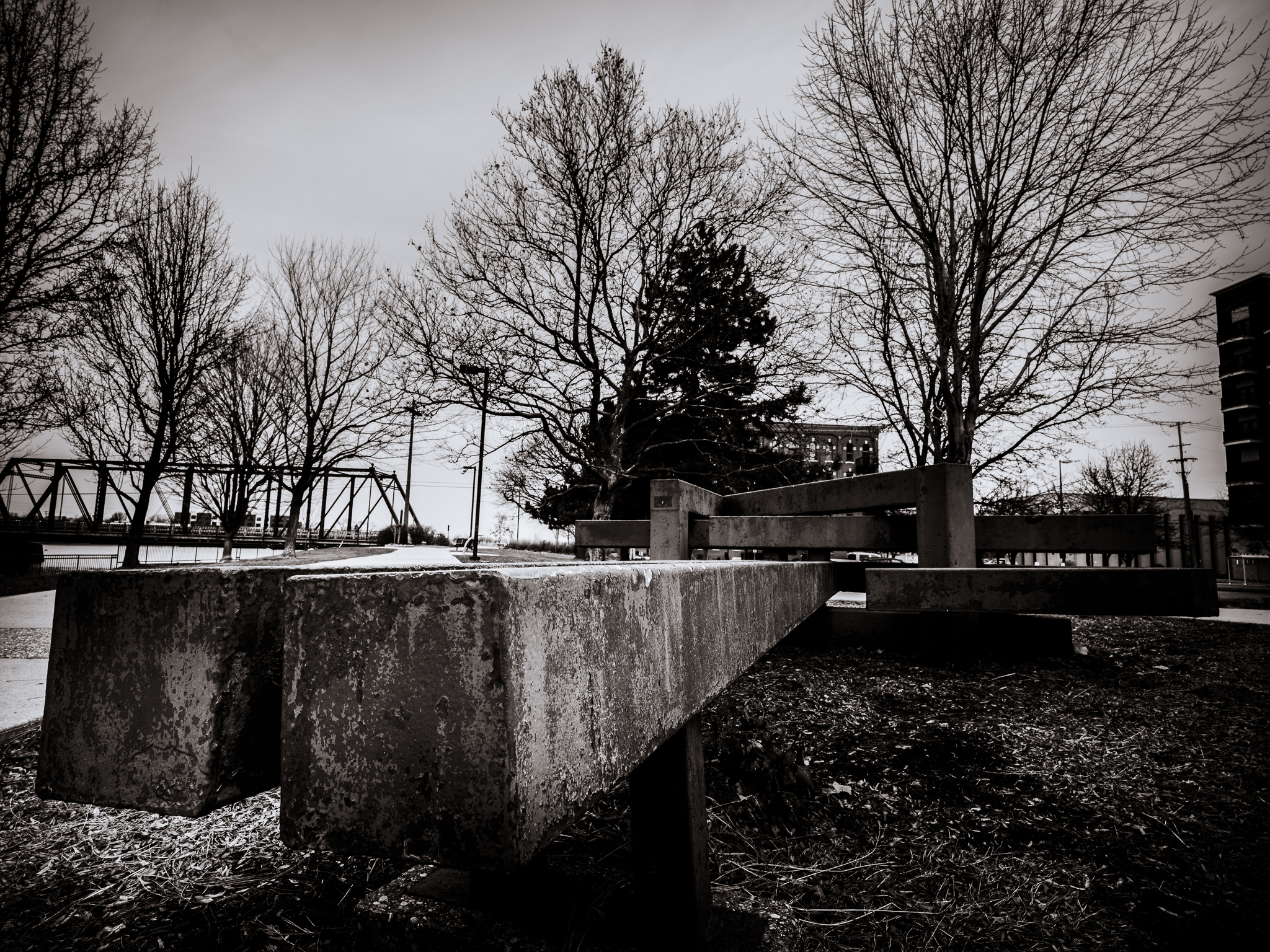
The first set of images is the same one processed two different ways. A cafe in Ada Village, a few miles east of Grand Rapids. One version of the image is in black and white, and I’ve left a hint of the angle of view distortion in the final. The other is in color, and I’ve mostly been able to get rid of all distortion. The exception is the corner where the walls meet. It looks much bigger than it is, and corner looks triangular rather than square. Try a close up image of a person’s face with a wide angle lens–such as your cell phone–and the big nose look will illustrate what I mean. The image that follows is of a piece of art in the park near the Sixth Street Bridge. It has that big nose effect going big time.


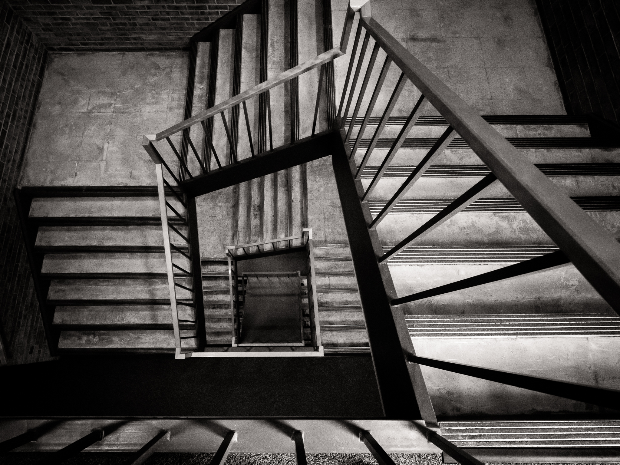
The next set of two images is the cover image replayed. These are actually two different images of the same staircase in the Hekman Library at Calvin University. I was looking down from the fifth floor. The first, the cover image of the blog post, is in black and white. The second is in color, to highlight the leading line of the handrail on the staircase. There’s a second difference, a detail you’ll notice it if you look carefully at the bottom of the image. I did it on purpose, if you’re curious.

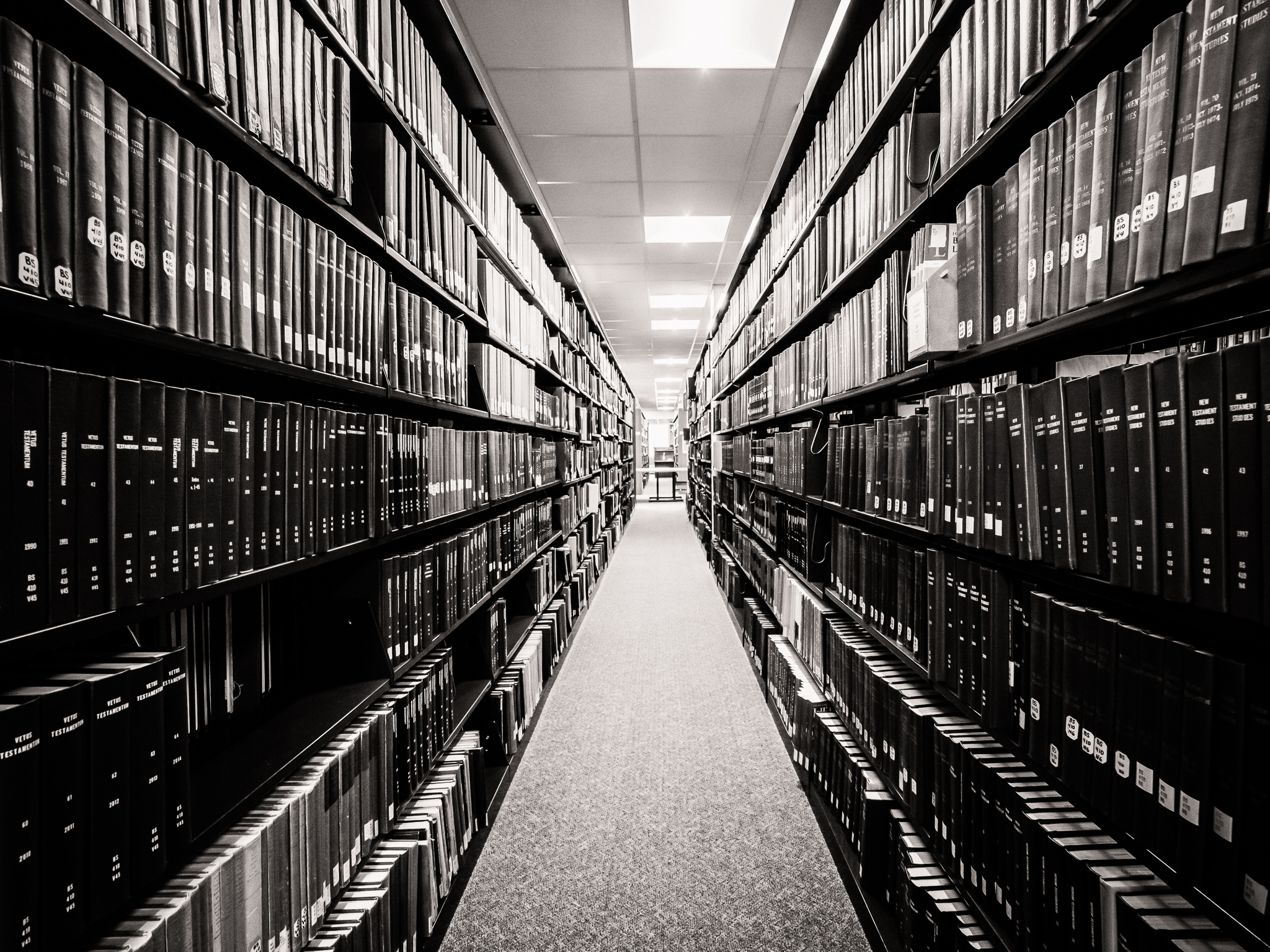
After walking down the stairs, I did a few images of tables, shelves, etc., to play with lines. Here are two of them. One is a long distance view down a row of books and periodicals in the stacks. The second is a short distance view of boxes on shelves in the archives. I like the second one for the the detail of the two old microfilm readers on a table against the wall. They somehow remind me of two people. They look a big lonely.

Finally, again in Ada Village, a view of the dam. This is nothing spectacular. I’ve not done any landscape for a while. This was simply about the colors and the shape of the spillway and water on the “other” side of the dam.
I liked the muted color of the grass. As it dies over the fall it gets a beautiful gold-brown tone, especially in cloudy wet weather. Perhaps its a reminder for me of the new life that will come next spring. I like the look of this grass almost as much as the classic “fall colors” we associate with tree leaves.

You can see a bit of distortion in the brick building portion of the dam, and more in the utility poles on the left. I had the camera pretty close to perfect alignment, but not quite. It would have been an easy fix in Photoshop but I decided not to bother.
I’m glad I got some images on Friday, taking the day off to get some stuff done, including time outside with a camera. It’s a rainy Saturday morning as I right. The rain should turn into a gloomy evening and Sunday. Maybe I’ll get out a second time tomorrow afternoon.
Stay warm and stay safe, everyone.
